In keeping with the title of this blog, in this post, I am going to contrast a Good UX with a Bad UX. Let’s start with the bad.
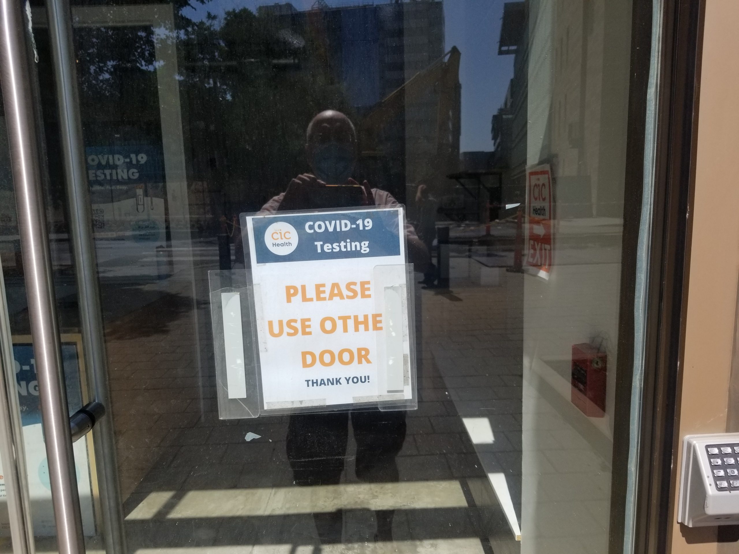
If you thought I was going to complain about the spelling of the word “Other”, … well, you wouldn’t be completely wrong. But the point I want to make here is “How little effort would have been needed to add an arrow to this sign?”
Is the “OTHE DOOR” to the left? To the right? Up a flight of stairs?
This hotel understands:
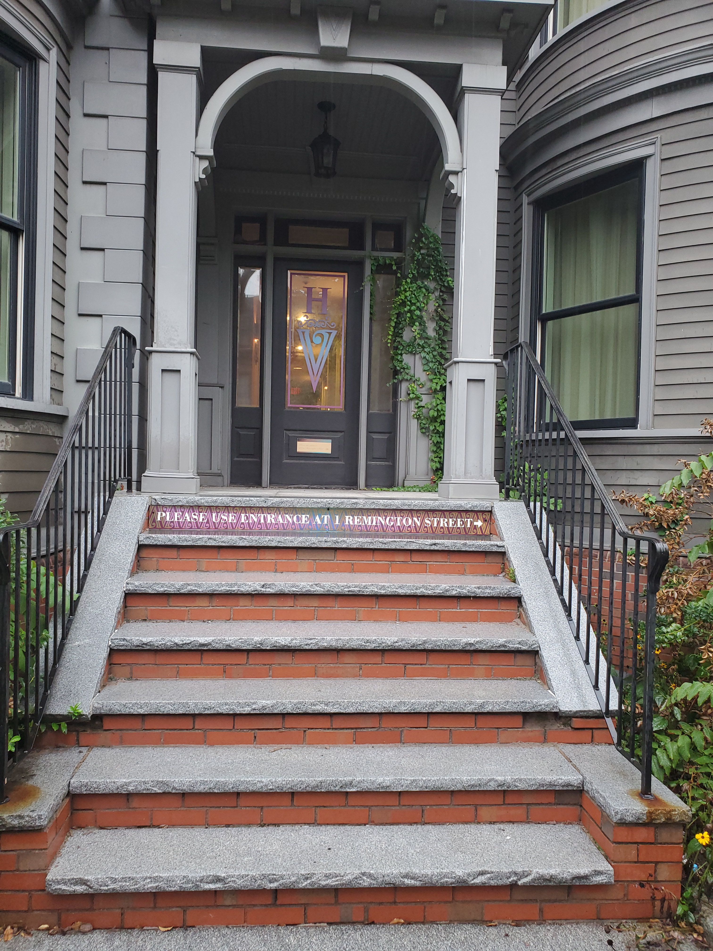
You don’t need Google Maps to tell you where Remington Street is!